
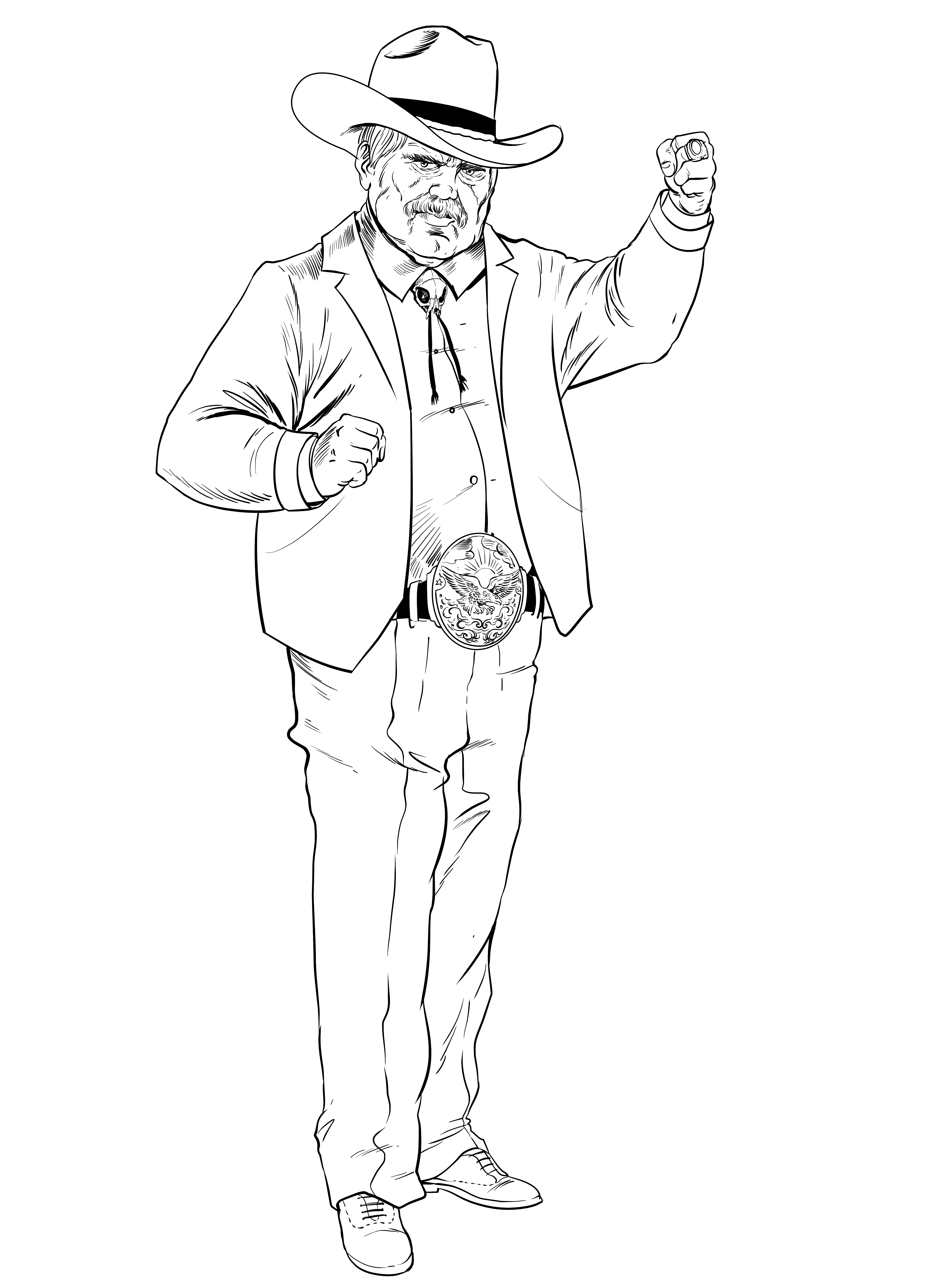
When we started building the visual identity for Trade Runner, we knew we wanted something that felt heavy, industrial, and unapologetically stark. The world we're creating isn't soft—it's a place where corporations have ground humanity down to resource extraction and quota metrics.
The aesthetic had to reflect that. We drew inspiration from brutalist architecture—those massive concrete structures that dominate their environment without apology. They're not trying to be beautiful. They're trying to be functional, imposing, and honest about what they are.
Design Pillars
We established three core pillars that guide every visual decision:
Heavy geometry. Sharp angles, thick borders, no rounded corners. Everything feels like it was stamped from sheet metal.
Stark contrast. Deep blacks against bright whites and a single accent color. No gradients, no soft transitions.
Industrial texture. Halftone patterns, visible grid lines, CRT scanlines—artifacts of machines, not nature.
The goal isn't to make something pretty. It's to make something that feels like it was built to last in a world that's falling apart.
The Accent Color
We settled on a vibrant cyber-yellow as our primary accent. It’s the color of caution tape, of industrial warnings, of “do not cross.” It punctuates the darkness without softening it.
In-world, this color represents the Traders' Guild—their corporate branding is everywhere, stamped on crates, flashing on terminals, glowing from the badges of enforcers. It's meant to feel both authoritative and slightly oppressive.
What's Next
In upcoming dispatches, we'll dive deeper into specific design decisions: the character silhouettes, the UI patterns for our interactive experiences, and how we're translating these 2D concepts into other media formats.
Stay tuned. And remember: in the wasteland, clarity is survival.